top of page
My learnings
When designing the logo, I mixed visuals, fonts, and simplicity to create something unique. I've found that picking the right colors, fonts, and symbols helps people recognize and understand the logo better. Understanding what the client wants and presenting the design well is a big part of what I've learned, and it boosts creativity a lot.
Inclusivity of name - AUM
Visual identity
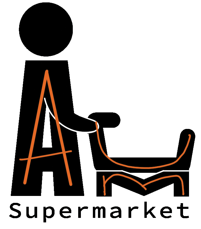
shopping cart
Aum Supermarket
In the eyes of client...
Aum Supermarket is a local supermarket in the city of Ahmedabad. We aim at having a logo which speaks for itself, contains the name and its purpose. Something that has a meaning of its name and gives it recognition.
Logo and Branding
"We are starting a supermarket that aims at providing almost everything in one store and we offer free delivery to the residents near-by as well"
Listening to what they had to say
Breaking down into keywords-
Meaningful
Creative
Highlight the name
Conveys the meaning in one go!
The name to
be the hero.
Something unique yet solves the communication
Use of type for logo in a creative way!
Typographic logo
Colors
Use of appealing and meaningful colors to catch consumers attention
Colorscheme
#F15A29
Primary color
Secondary color
#00696D
#A70805
Typography
Accessible
Reliable
Fresh
Welcoming
Friendly
A a
A a
Impact
Source code variable
#ffffff
#000000


Putting it to life
Logo
Brainstorming to proceed
Brainstorm
bottom of page