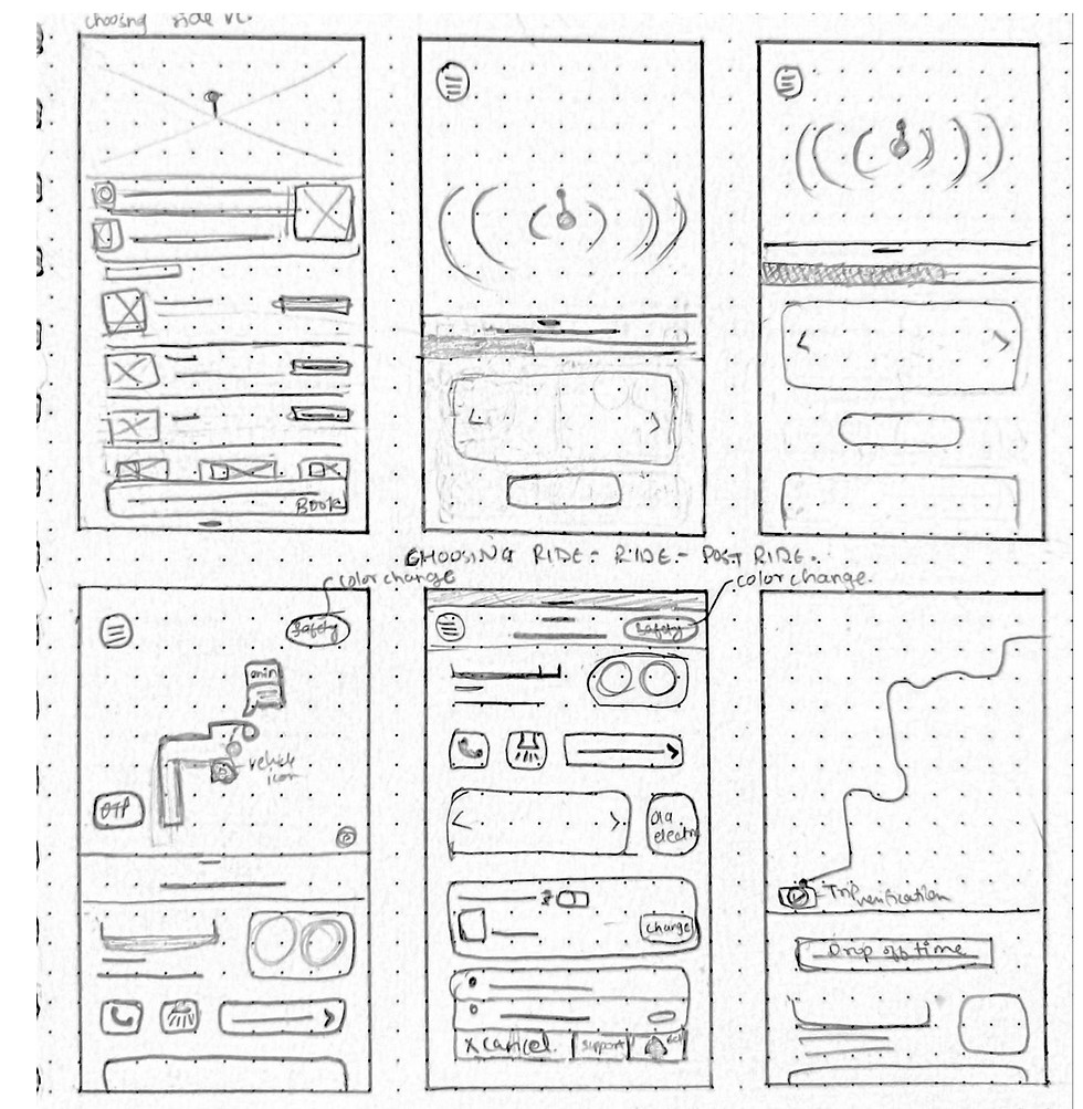


Adding a button making it easier for users to add their location to favorites hence makes the 'adding destination' process faster. (Previously to add a location to favorite you need to go to accounts or add only current location to favorite)
While user's wait for the app to confirm a ride is the only time they will have their eyes constantly on the screen. Using this time to showcase features like safety (primary), ola rental, ola outstation, ola electric. (Previously, there existed only a progress bar of confirmation of ride).
A spotlight features helps user and driver to find each other faster in crowded spaces. On clicking the screen turns in a pre-selected color, when the user waves it in air, it is easier for driver to reach to user quicker.
Adding two more features to safety, first DEFAULT LOCATION SHARING enables them to choose the silent hours of their location (e.g.- Gandhinagar: 11 pm- 6am), during these hours if a ride is booked, the app shares location to emergency contact. Second, LOW BATTERY DETECTION, this enables the app to send the ride details along with location to emergency contact for safety and payment (if online payment method, the emergency contact can pay if user's phone battery dies)
Adding a carousel and ads that attract user's attention and communicates ola's features on home page. (Previously it was just inviting a friend)
Changing the position of safety button. placing it nearer to user's reach when in emergency situations. (Previous position- top left corner)

Ola
UX - UI
A research to understand the user experience of Ola app interface considering the communication of features, awareness and easy - quick access. Giving travel and Safety aspects utmost importance.
A comparative study (Uber) to understand what, where and how one enhances the experience, makes easier and communicative features and interface for users.
Understanding the competitors


Home page
Hamburger/ Account page
After looking into what Uber users think, it seems they prefer it because it's easier to understand and does a good job of letting them know about its features. Uber also emphasizes things like safety, which makes users feel good. All of this helps make the interface and branding better.
The questionnaire contained both, close and open ended questions. It helped me understand the ratio of awareness and understanding among users.
There were questions which helped me understand few issues faced by users and reach towards a conclusion.
Interviews (summary)
Categorizing all the issues faced by Ola users


Empathy Map
User Persona

Stakeholder Mapping


POV Statement
How Might We?

Task Flow (Book a ride)

User Flow


Secondary Research
Primary research
Tools
Low Fideity
Mid Fidelity


Onboarding and
primary task (booking a ride)

